These are older posts. See https://www.techlib.com/solarflare.htm for the latest.
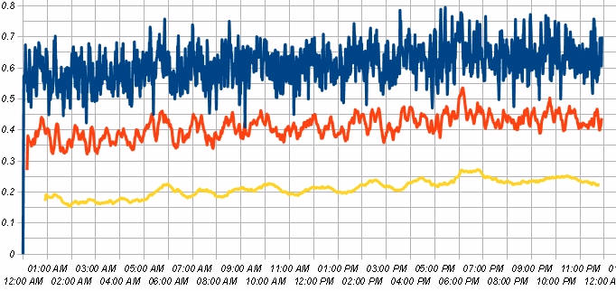
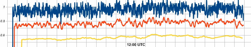
We just had a sizable flare, peaking at M6.6. Below is the last three days of data. The flare occurs right at the end of the plot.
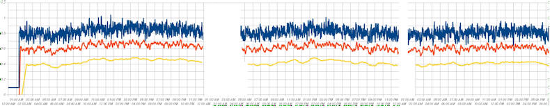
Granted, there are some dead spots that I covered with white to avoid confusion (the averages dip when there's no data), but there just isn't any sign of a significant dip. Keep in mind that the reported effect for X class flares would be on the order of six divisions, pushing the yellow trace off the bottom of the chart. All I see is the regular wander I've been getting all along. The last section is about 16 hours of data, one of the smoother curves I've seen, then there's an hour gap (more gap for the running averages, simply because they're averages). The effect couldn't be hiding in that one hour gap. It just isn't happening, at least at the M class level. Not even Al Gore could predict M class flares with this data!
If this were Myth Busters, I'd have to say, "busted!" Well, for M-class flares, anyway.
I'll continue the plots in case the event has to reach into the class-X range to be seen. We are talking orders of magnitude, so it's possible these flares are simply too small.
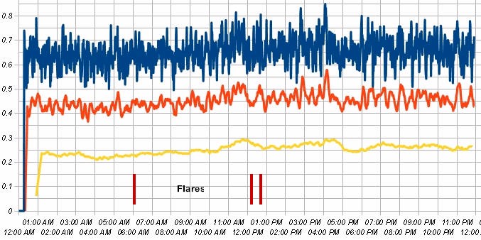
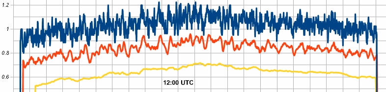
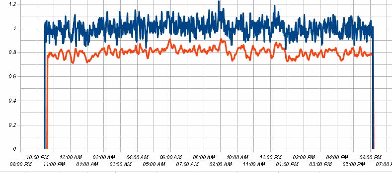
Here's an interesting negative result (1/27/11). There was a M-class flare at 1 AM (1/28/11), following a complete day of little variation in the chamber plot:
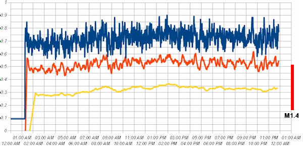
There hasn't been much variation in the plot for weeks. The plot varies around about +- 0.05%. The previous dip circled below is also typical of the chamber's wander. It's starting to look like a Weegie Board could predict flares as well. My understanding is that the order of magnitude to expect is well above this wander, perhaps over 0.3%. Such a variation would have pushed the yellow trace off the bottom of the plot. This was a smaller M-class flare, so maybe it takes a whopper. I'll keep the plots running.
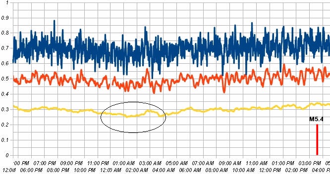
Today I was pondering a drop of one division that happened last night (see oval). I checked for flares and there were only a couple of smaller ones this morning. As I was wildly speculating that a big flare was coming, an email alert arrived and my SID receiver started drawing a vertical line! It hasn't quite finished as I write this (see the WWVB chart below). That's a large, M5.4 flare. The chart to the right is the ionization chamber output with the flare indicated on the right side. I had to manually enter the 1 hour moving average data between 12:00 AM and 1:00 AM, because that's where the spreadsheet starts over, but you can see the 1-hour average dropping a full division (0.05%). You can see the dip in the raw 1-minute data, too. To be honest, I don't know what to make of this. It's entirely possible that the chart would have done the exact same thing without the flare. The chart has been bouncing around 3.0 for a few days now, but that extended low section in the oval could be within the expected wander. It does look like something pushed it down for a while.
Here's the rest of the day:
It looks like it's dropping again.
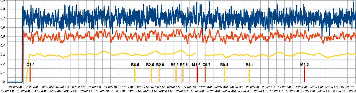
Here's two days worth of data, starting 11/4/2010. I simply pasted two graphs together. There were several solar flares, as indicated, including a couple of M-class. I can't really see anything related on the charts. The ten minute and one hour average plots have gaps, simply because that's where the next day begins. These aren't huge flares, but it looks like my americium is ignoring solar activity, so far. Flare peak data is from NOAA.
(11/3/2010) A little more of the upward drift is visible. The three red lines are the approximate times of smaller flares (all C-class).
There's a little upward drift today (11/2/2010). It doesn't match the pressure or temperature curves, so it's still a bit of a mystery. I'm monitoring power supply voltages and the case temperature and all are stable.
11/1/2010: Pretty uneventful today, but the system seems to be working well. The was a C-class flare today at 4:36 AM.
10/31/2010: The plot below has a more sensitive vertical axis than the earlier plots (0.05% per division). The time is UTC. The top trace is the raw 1-minute data, the middle is a running average of 10 and the bottom trace is a running average of 60 (one hour). The last few improvements seemed to have made a difference. I added a shunt regulator to the chamber bias supply that seems to be holding a few millivolts at 110 volts, a big improvement over the previous supply. I increased the gain of the first amplifier from 25 to 300. With that change, an ion chamber current change of only 1% encompasses the full span of the D/A , so its drift should be out of the picture. I also improved the offset voltage circuit to give the potentiometer much less range, to eliminate any temperature drift it was adding.
To give you a feel for the sensitivity, the effect that was attributed to a flare in one paper would be six to eight divisions on this plot. I've been assuming that I have to look for quick, flare-related changes due to longer term drift, but I'm not seeing a reason I can't keep this thing running long enough to see seasonal variations. I suppose a power failure might wreak havoc, and my tiny UPS can't keep a temperature chamber running! If I see anything at all in the short term, I might design a much lower power temperature-controlled ionization chamber for longer period observations.
10/27/2010: There's a nice inverted bowl shape that I can't explain. "All systems are go," as far as I can tell.
I added a 1 hour running average trace today (10/26/2010).
Now we're cooking. This is the plot so far today (10/25/2010). The vertical scale is calibrated in percent of full-scale. The short-term variations in the red, 10 minute moving average trace are too quick to have been induced by temperature, pressure or humidity. I think I can see a slight bump up at about 2:00 AM, then a hop back down around 1:00 PM of about 0.03%.The transitions seem to be preceded by noise. It might just be system noise, but this is enough resolution to be interesting. This is a nice, long plot that is fairly straight; 0.3% would be huge on this scale. OK, nature; surprise me.
This has become the project that ate my hobby! It's already 10/24/2010 and I'm just now ready to start seriously monitoring. I've vanquished the temperature problem and determined that the pressure isn't an issue. I pushed the experiment to the back of the bench and removed all the extraneous wires, clip leads and components. Of course, in the process, I plugged too many things into one circuit and popped a breaker. So more waiting...but tomorrow should be the beginning of some nice plots like the one below, but without any uncertainty about temperature and pressure influences. I also measured the full-scale sensitivity and calibrated the spreadsheet in percent of full-scale.
It's still drifting downward due to the power outage, but it looks like the running average of 10 minute plot might stay within about 0.1%, once it stabilizes. One article suggested an event associated with a flare might have caused a 0.4% change. That's four full divisions on this plot, so that would be easy to see! Actually, I've noticed it's fairly easy to see changes much smaller than the p-p variation, as long as they're systematic. For example, if the plot suddenly drops 0.05% and stays down for a few hours, it should be easily noticed. Of course, it may turn out that there is flicker noise and the plot will wander more than that. It's quite possible that the plot directly below is as good as it gets (two divisions are 0.1%), with a little wander on the multi-hour time scale.
Last night (10/20/2010), I placed the device in a glove box and determined that it is quite insensitive to pressure changes. A change of 1 inch of mercury had no effect for hours. However, the sealed box converts temperature changes into internal pressure changes and it has a pretty high temperature coefficient. Tonight I will determine if my temperature controller is adequate and look into a simple temperature compensation scheme, if needed.
Today's plot (10/16/2010) looks pretty good. This scale is expanded to .05% per division, and the red trace is a moving average of 10 readings (10 minutes worth). Although this might be usable, there is a tiny bit of wander that I want to understand. I've taken the unit out of the temperature chamber and placed it in my glove box where I will be able to change the pressure a full inch of mercury to see the effect. I will also check the temperature coefficient at the same time.
Here's the plot for 10/18/2010, after I improved the seal. Hmm, it looks like I had a leak, as I feared. There was plenty of solar activity today, so if there's any effect, it's significantly smaller than I was seeing. It's unkind the way the barometric pressure conspired to trick me! Five counts on this scale represents 0.1% of span. Everything below is questionable.
Today (10/17/2010) I "predicted" a flare and hit it within an hour. No doubt it was total luck. Here's a combination of the ionization chamber's output and a plot from one of the GOES satellites:
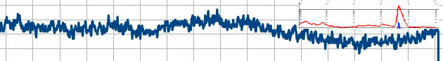
The red plot shows the solar flare. I tried to scale it so that the time scales are the same and I got pretty close.
The plot ends at 19:00 UTC and the divisions are one hour. Note the bump that peaks at about 11:00 UTC, followed by the decline that drops a full division below the average, or about 0.2% of full-scale. The flare occurred about seven hours after the peak, very much like the six hour delay below. The plot below shows a larger deflection and the flare was much bigger.
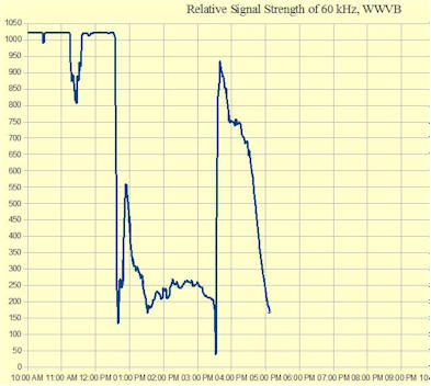
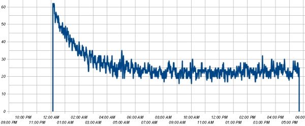
There was a huge solar flare (M3.0) today (10/17/2010), and it pegged my 60 kHz SID receiver:

This chart was made using the Oddball SID Receiver.
The early and late portions of the above chart are at night when there is a large sky wave signal; they're interesting, but should be ignored for this experiment. The "pertinent" stuff is between about 1:00 PM and 12:00 PM UTC. A little after 7:00 PM, UTC, the solar flare quickly ionized the lower ionosphere and the reflected signal from WWVB jumped up, right off the chart. Then, the ionosphere's reflectivity returned to daylight normal in an exponential fashion.
Here's the intriguing part. This is what the Radioactive Decay Experiment did today:
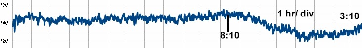
Here's the rest of the day (below). The chart is politely returning to the nominal reading just above 140. This chart has a large offset and 5 counts is equal to 0.1% of the full-scale span. The apparent effect is about 20 counts or 0.4%. I thought something was wrong, so I spent a lot of time checking local parameters like barometric pressure and temperature, but nothing looked like this chart.
(The time scale is offset because I'm still experimenting, and I didn't particularly care when I started the graph.) The apparent peak was at about 8:10 AM, and the following dip dropped about 0.4% of the total span. (The graph is highly offset from zero.) You know how scientists are always claiming to see new stuff? Well, I claim to be the first to see that little peak before the drop in the radioactivity. : ) The SID occurred near the end of the plot around 2:10 PM.
I'm still suspicious that I have barometric pressure issues, but today's pressure plot doesn't look like this curve and the curve was quite flat for 10 hours. Plus, the pressure is going through direction changes as the chart settles back to normal. The chamber is sealed, so it isn't obvious how pressure changes are having any effect.
Did I just predict a solar flare? I've been checking the pressure, room temperature, chamber temperature, voltages, etc, trying to figure out why my graph suddenly started drifting! What I haven't mentioned is that I saw some unexplained drifting last night, too. One researcher claims to have seen such effects, over a day and a half previous to a flare.
It was early this afternoon when the idea occurred to me that I should really check to make sure I wasn't seeing something "real." Imagine my surprise when my SID receiver had the huge response on the chart. Now it really looks like I saw the flare coming.
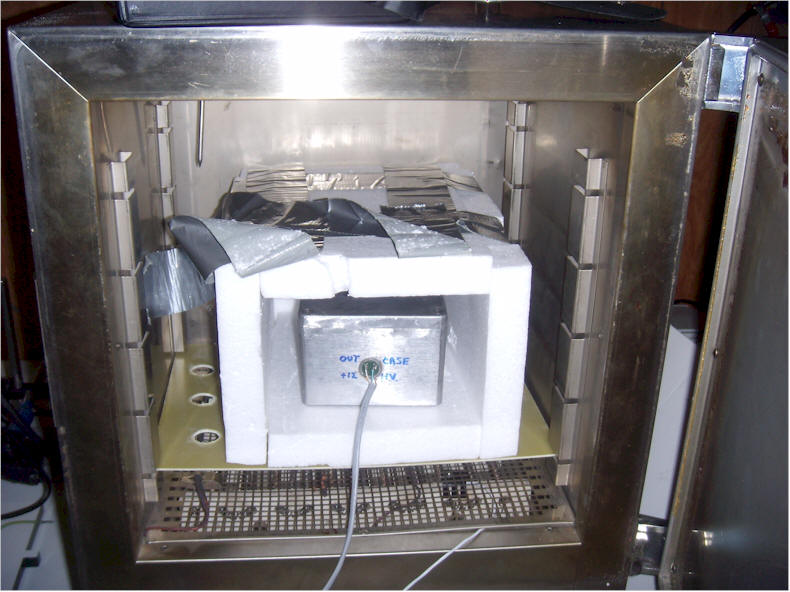
This simple bang-bang controller added to the temperature chamber holds a fraction of a degree inside the Styrofoam box shown below. The chamber's original control becomes an over-temperature safety switch.
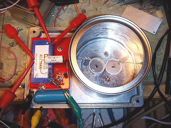
The new ionization chamber has two smoke detector elements inside. The aluminum lid to the top, right was used to shield the elements to check the zero.
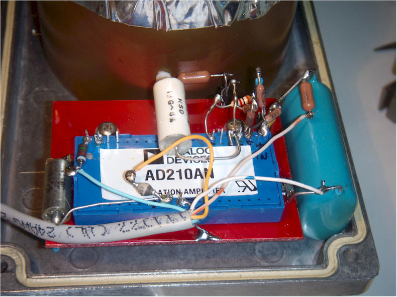
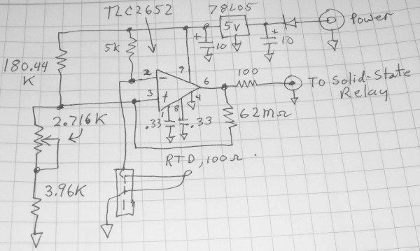
The preamplifier floats and is biased with an external supply. That allows the chamber to be grounded relative to the outside world. The FET was biased to its zero temp-co point by selecting the source resistor and the zero was set by selecting a voltage divider for the output amp. The resulting temp-co should be well under 10 uV/C at the operating temperature. The temp-co is bowl-shaped and changes about 200 uV from 25C to 35C, with the flat portion at about 30C, where the chamber will be set. (The poorly labeled box in the schematic is an AD210AN isolation amplifier.)
There's actually a current limiting resistor in series with the H.V. line (1 meghom).