
This SID detector responds to increased ionization in the ionosphere due to solar flares during daylight hours. Plots include data from yesterday and today. Check the time (select UTC, 24-hr) to see where the new data is being recorded. There is usually a noticeable discontinuity where the new data ends and the old data remains.
Two red traces indicate that I had to restart the computer and one of the traces will clear in a day. The black trace is either unused or serving a special purpose.
Points are plotted every 15 seconds for 24 hours and the chart is updated every 5 minutes (Click shft/refresh). There are a total of 5,760 points on the graph.
Click Here for latest plot of Solar Flares (OneDrive no longer supports embedded images)
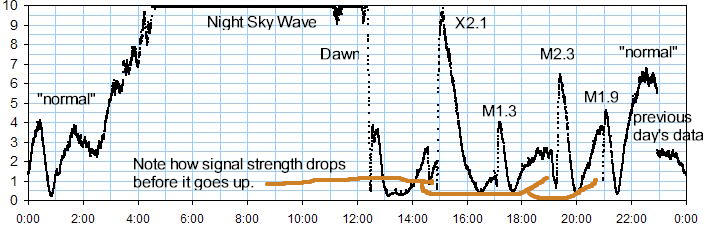
WWVB, 60 kHz, Magnetic (loopstick). Graph Date and Time are based on your computer's clock but the graph timescale is GMT. New data overwrites previous day's data. The useful portion of the SID curve lengthens in summer giving up to 10 hours of monitoring. In January there's only a few hours of good sensitivity.
The SID plot is "live" again and the plot should look much better going forward. The culprit was a new "brushless" or "variable speed" outdoor condenser unit (air conditioner). It dumps so much RF on the power line that the manufacturer recommends a power line filter to "stop your LED lights from flickering." When I switched over to LEDs in my workshop it would turn into a discotheque of flashing lights when the compressor came on. The filter stopped that behavior but not the RF interference. I've gone back to a compressor that needs a run capacitor!
The plot is from the newer Oddball Sid Receiver using a loopstick antenna. SIDs will cause spikes between about 12:00 and 0:00, where the plot is normally low. The high portion between 0:00 and 12:00 is nighttime sky wave. The width of the useful SID window is a function of the season, being longer in the summer.
To confirm a flare, see http://www.swpc.noaa.gov/products/goes-x-ray-flux .
If the red trace drops to zero suddenly WWVB may have gone off the air; Check the NIST website to confirm.
These SID charts are only useful for detecting flares during the daylight hours. Below is a plot made on 10/25/2013, ending at 23:00. The plot between about 22:00 and the next day at about 12:00 is reflection from the higher ionospheric region (F layer). The lower-loss reflection yields a strong signal and is why clocks and watches using WWVB usually calibrate at night.
Note the signal actually drops before it rises in the fall during a flare, winter and early spring here in Austin. That usually doesn't happen during the warmer months as the lower C layer is sufficiently ionized to be slightly reflective without a flare.
I'll post a few interesting captures here (Black traces with red traces were NAA at 24 kHz):
|
Lots of "area under the curve!" |
This flare started one hour before and ended one hour
after |
But then another eclipse occurred on 10/14/2023.
There was also a flare but it didn't seem to interfere with the effects of the eclipse. The max obscuration was at 16:54 in Austin but the signal path is from Boulder, Colorado. |
|
|
|
 |
|
|
||
|
Here's a weird series of flares 1 hour apart. The bottom is NOAA data. |
Note how well the SID plot tracks the actual X-ray data. |
This powerful X-class flare reached for the top of my plot! (9/10/2017) |
 |
 |
  |
Regarding that large flare to the right, notice how much better 60 kHz works in Austin for flare detection (red trace). Also note that the 24 kHz signal turns off right at a critical time. WWVB is a much more reliable signal. Of course, that "unreliable" signal is keeping us alive and safe. Hard to complain. : )
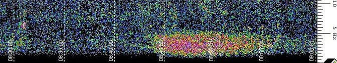
This spectrogram updated every 5 minutes (hold shift and click refresh). It displays 0 to 58 Hz vertically. The horizontal time scale shows the newest data to the right and the vertical dotted lines are 5 minutes apart. This is my front yard microphone with the transistor preamplier. The amplifier boosts the sensitivity below 10 Hz giving a useful response to a little below 1 Hz. The microphone has moved to a new house near a very large water treatment plant. No doubt there will be interesting sounds from there.
Click here for latest plot.Graph Produced by Spectrum Lab |
9/19/2019: There was a large structure fire about 3 miles from my house early this morning. Here's what the infrasound microphone heard:
The calls to the fire department came in at 3:41 AM, a few minutes before the red begins. Here's the full image. I wonder what that little red spot at 7 Hz is around 3:31 AM - the beginning/cause? My current theory is that the water sprayed on the fire turns to steam causing a sudden increase in local air pressure and that's what causes the infrasound pressure waves. The billowing smoke and flames don't seem likely to produce infrasound of this magnitude. Lots of air has to move to generate sub-5 Hz infrasound and I could see the vaporized water (which is a gas, after all) pushing air away significantly. I wonder if we see the very moment water was sprayed onto the fire.
Hurricane Harvey generated quite a lot of infrasound, making the bottom of the chart light up well before landfall. (My location is Austin, Texas.) Here's a snap of the bottom of the chart Saturday morning:

Previously I've seen thunder before it could be heard but nearby highway construction cast doubt. This is clearly the hurricane! When I first saw this low-frequency noise on the spectrum it was quiet outside, at least to my ears.
Here's what the Austin City Limits concert looks like from a couple miles away:
 10/7/2018, 5:00 PM
Look at those bass notes at the bottom! You can see the harmonics from the thumping. Believe me, it's thumping but the part one can hear is further up the spectrum.


